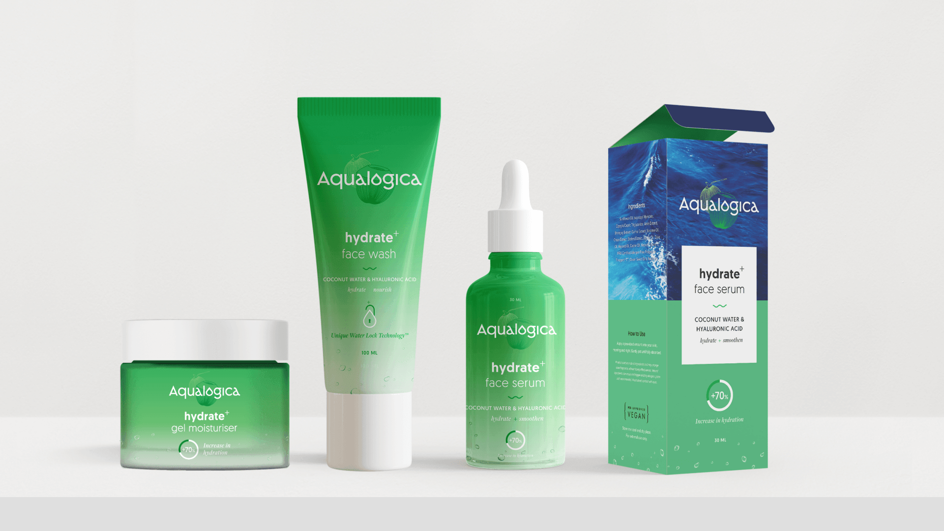
Building on our successful collaboration with the Honasa Group across Mamaearth and Derma Co., we were re-engaged to create a hydration-led skincare line—one that could carve out a distinct identity while remaining rooted in proven brand-building principles.
We approached the identity with a focus on balancing premiumness, approachability, and freshness. This came to life through a typographic logo that subtly evokes the fluidity of water, weaving a sense of movement and hydration directly into the letterforms. The result is a mark that feels both refined and inherently connected to the product’s core promise.
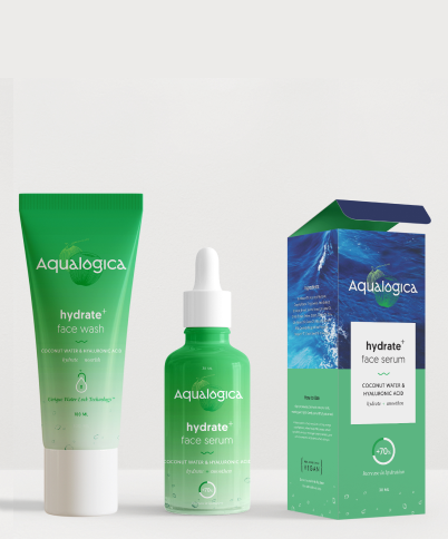
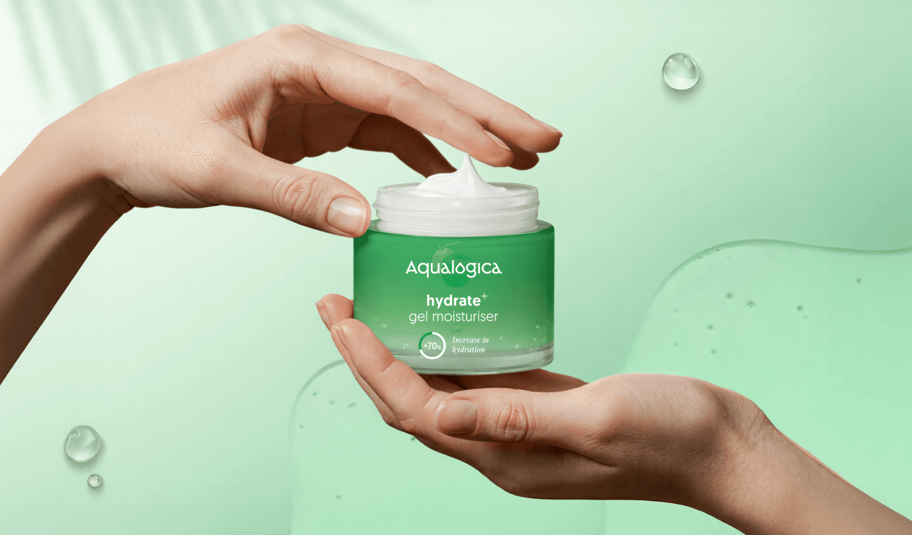
Extending this fluid, minimalist language, we developed a packaging architecture built around hero ingredients such as melon and coconut, designed not just for immediate impact, but for long-term scalability across an expanding ingredient portfolio. The system adapts seamlessly across a wide range of formats, from jars and tubes to bottles and mono-cartons, ensuring consistency without sacrificing flexibility.


Alongside the wordmark, a standalone monogram based on the alpha symbol was developed. Designed to work independently or as a subtle watermark, it reinforces the identity across multiple touchpoints, adding layers of meaning and visual depth.
The typographic system was chosen to communicate scientific credibility, clarity, and global relevance, while helping a complex and highly technical field feel more accessible and human. The overall design reflects a creative partnership, visually representing the coming together of scientific expertise and purposeful design, and echoing Aspergen’s own collaborative approach within the biosimilars space.
The identity was formalised within a comprehensive brand guidelines document, defining colour, typography, texture, imagery, and their application as a cohesive, singular expression. Together, these elements reinforce Aspergen’s mission: improving patient access to life-changing therapies by combining cutting-edge science, rigorous research, and regulatory expertise to deliver innovative biosimilar solutions.