The collaboration between Mamaearth and Lucid has been highly successful, transforming a small skincare brand into a billion-dollar enterprise. Its rise as an Indian company reaching a global audience is the result of a powerful alignment of factors. Chief among them, design, which has played a particularly significant role.
When Mamaearth first approached us, it was primarily a children’s skincare brand looking to expand into the lucrative 14+ mass premium market. The key challenge was to retain the strong connection it had built with its existing audience through baby-friendly products, while offering them credible skincare solutions for older consumers, grounded in the same clean, trusted ingredients they already associated with the brand.
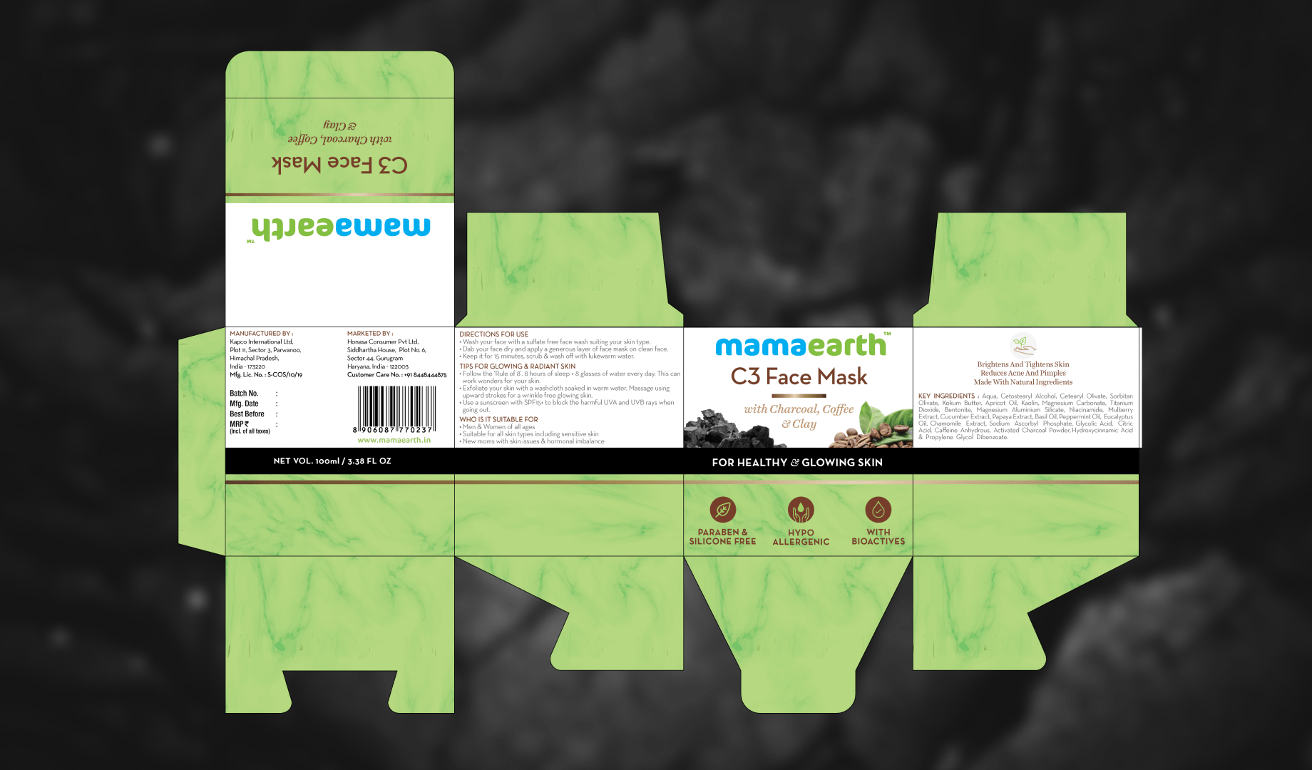
From a design perspective, this meant preserving familiar elements while introducing an entirely new architecture capable of scaling to support a wide range of new products.
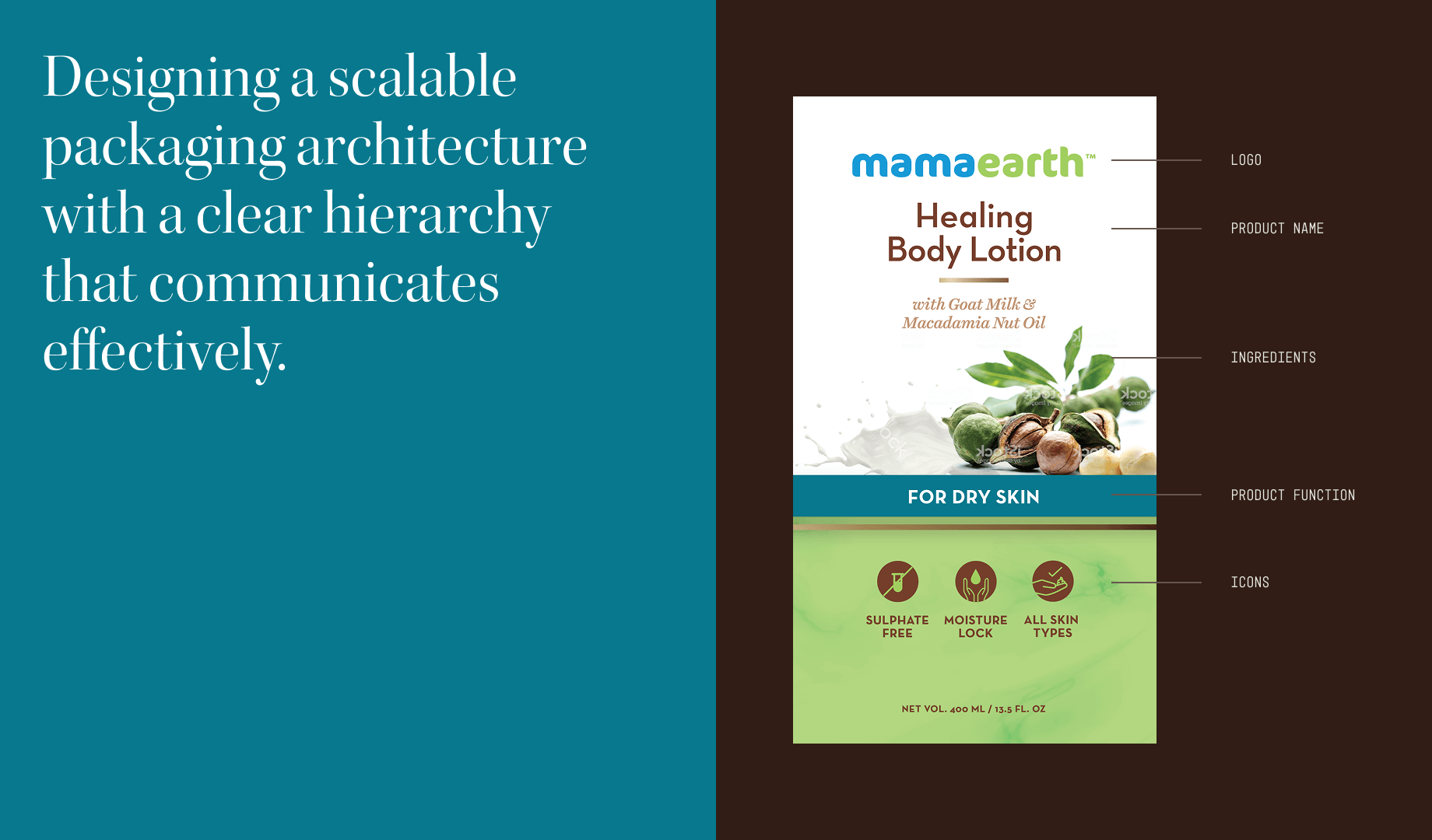
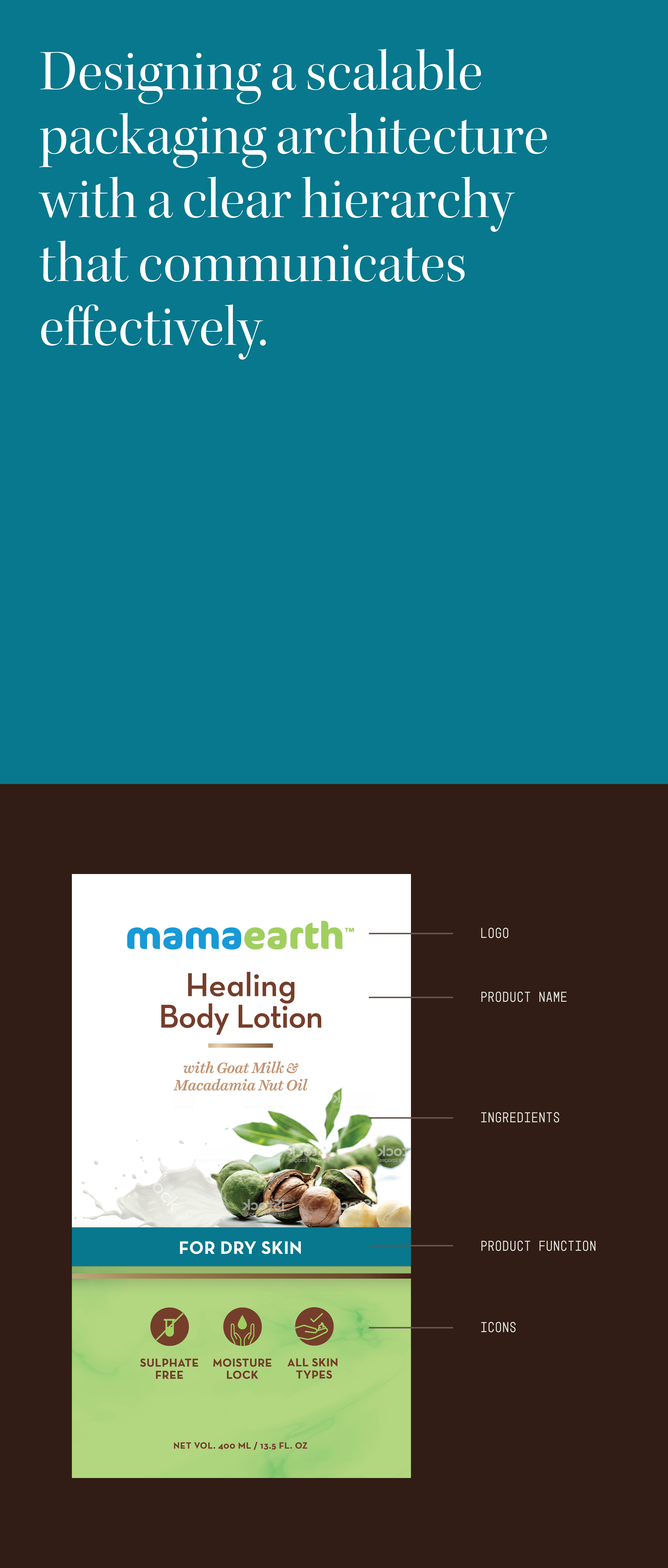
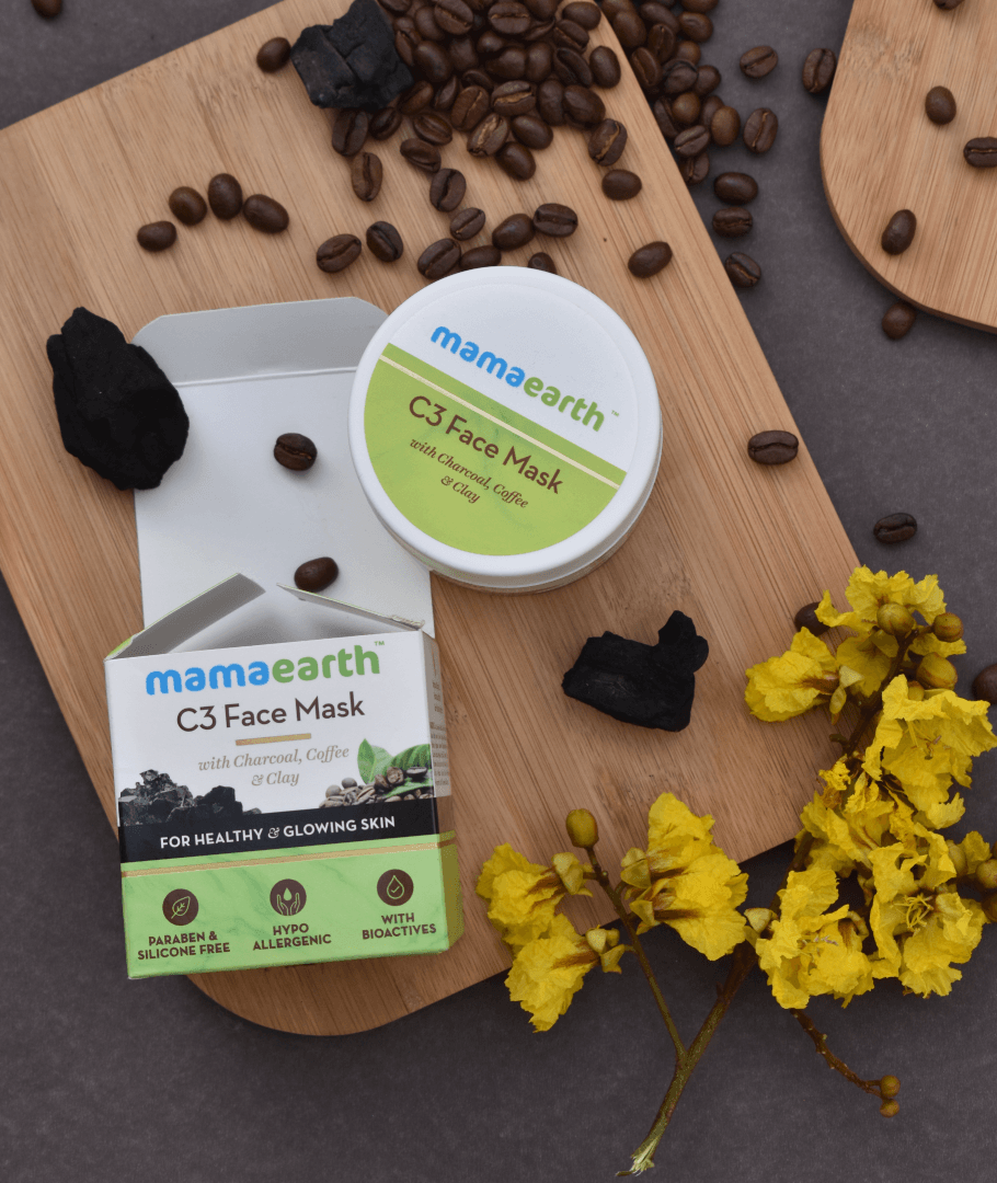

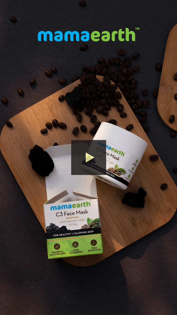
During the concept development process, several key ideas emerged that shaped our objectives: namely, establishing a clear content hierarchy and creating an architecture that could easily extend across other products and formats. The hierarchy began with the logo, followed by the product name, reinforced by visually rich ingredient imagery, a distinct product function band, and finally supported by icons showcasing the benefits.
The on-pack content hierarchy was crafted to do more than capture attention across both digital and retail environments. It was designed to remove ambiguity at every step. By leading consumers through information in a deliberate, intuitive flow, the labels fostered clarity, trust, and a sense of proven effectiveness, ultimately connecting with those seeking premium skincare at accessible price points. The strength of this connection was reflected in the brand’s meteoric growth in sales and the significant value it generated for the company.